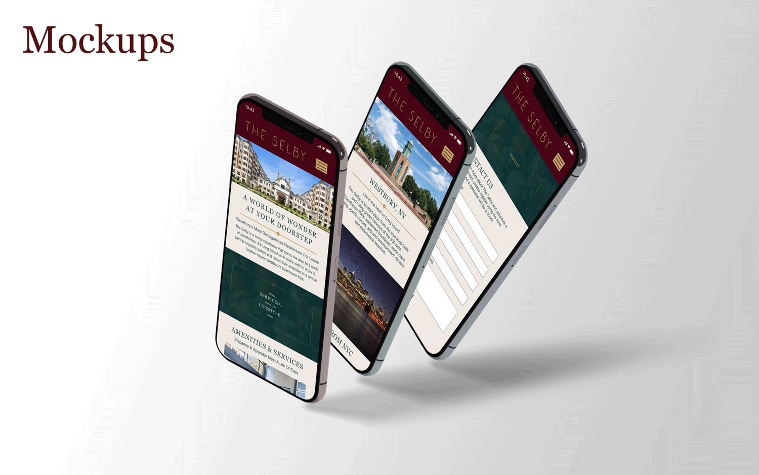
Project overview
The product:
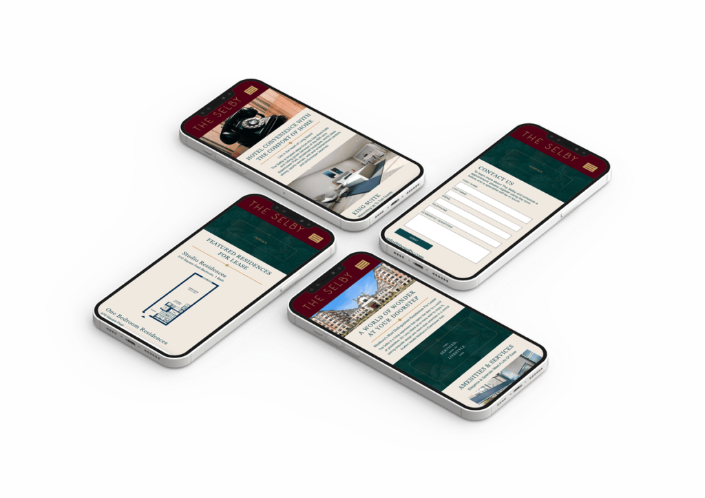
The Selby is a residence hotel that that opens the door to a world of possibilities. Studios to 3 Bedroom Residences starting from $3,800 per month.*
Project duration:
October 15, 2022 - July 17, 2022
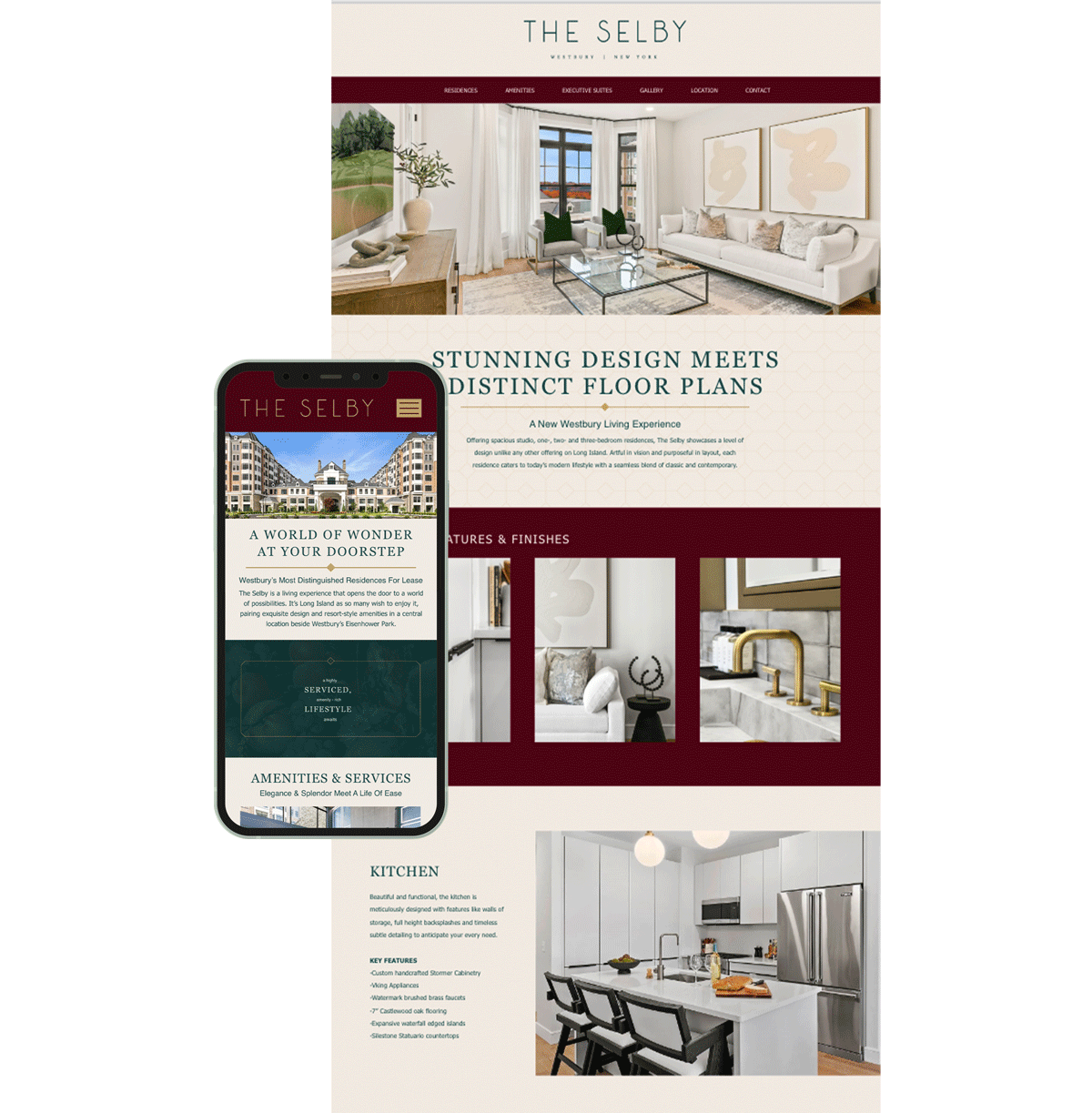
Project overview
The problem:
Create a website that represent the look and feel of the hotel so user are able to get in contact with the leasing office.
My role:
UX designer designing the booking app from conception to delivery.
The goal:
website to be user friendly by providing clear navigation and offering a fast to make an appointment with the leasing office.
Responsibilities:
List the responsibilities you had throughout the project - e.g., user research, wireframing, prototyping, etc.
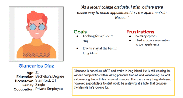
User research: Summary
I conducted user interviews, which I then turned into empathy maps to better understand the target user and their needs.
Persona: Carlos James
Problem Statement:
“As a recent college graduate, I wish to there were easier way to make appointment to view apartments in Nassau”
User research: pain points
AI:
Text-heavy menus in apps are often difficult to read and order from
Pain Point:
Responsibilities:
List the responsibilities you had throughout the project - e.g., user research, wireframing, prototyping, etc.
Starting the design
Sitemap
As a result, I created a sitemap based on the fact that users had difficulty navigating the website.
My goal was to improve overall website navigation by making strategic information architecture decisions. My structure was designed to make things as simple and straightforward as possible.

Usability study: findings
Round 1 findings:
1: The view amenities button didn’t take the user to the right page
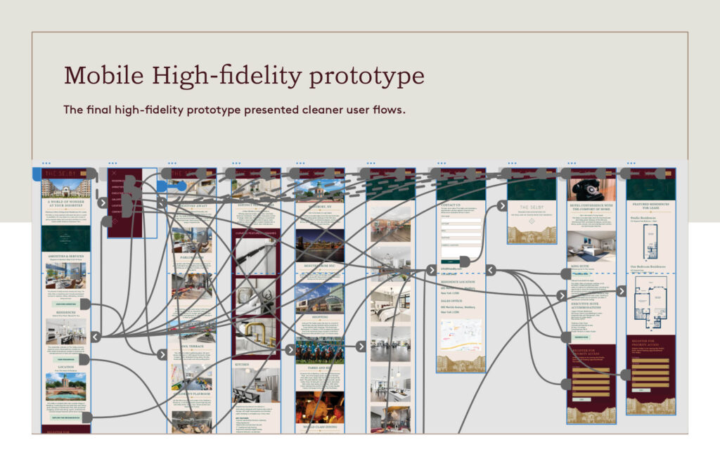
2: Mobile version couldn’t take you back to the homepage
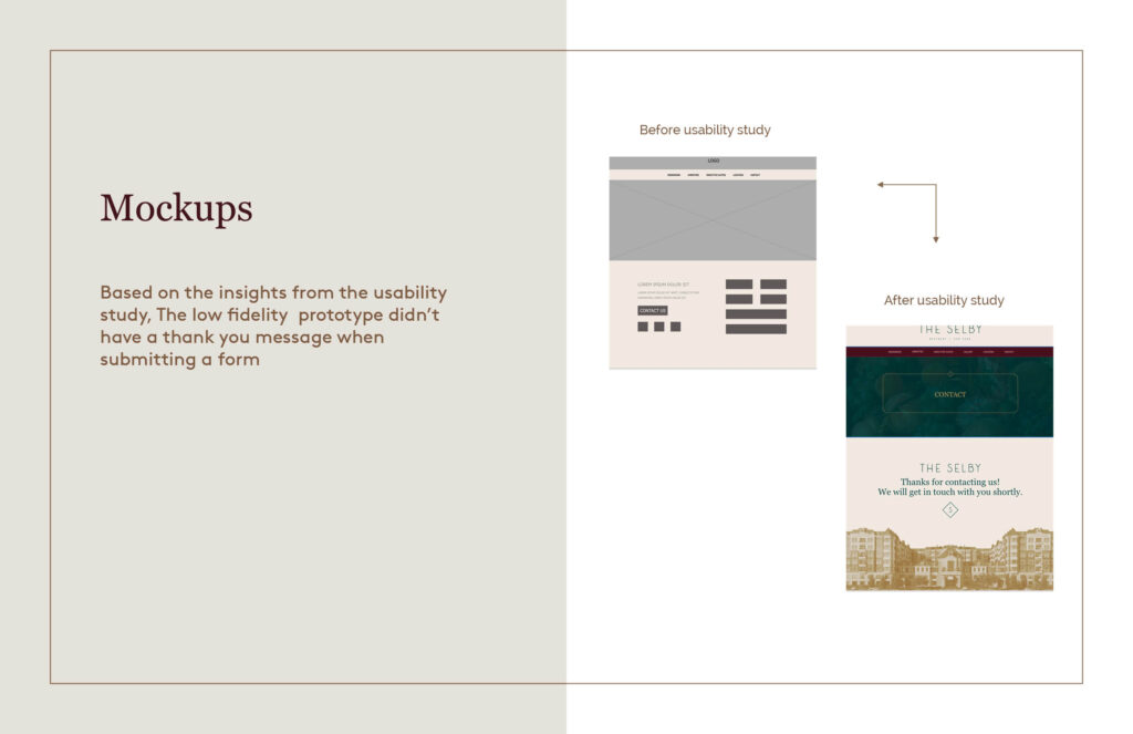
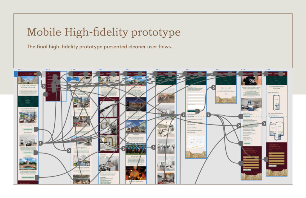
3: The low fidelity prototype didn’t have a thank you message when submitting a form
Accessibility considerations
As a result, I created a sitemap based on the fact that users had difficulty navigating the website.
My goal was to improve overall website navigation by making strategic information architecture decisions. My structure was designed to make things as simple and straightforward as possible.
Going forward
Takeaways
Impact:
Our target users shared that the design was intuitive to navigate through, more engaging with the images, and demonstrated a clear visual hierarchy.
What I learned:
I learned that even a small design change can have a huge impact on the user experience. The most important takeaway for me is to always focus on the real needs of the user when coming up with design ideas and solutions.
Next steps
Round 1 findings:
1: Conduct follow-up usability testing on the new website.
2: Identify any additional areas of need and ideate on new features.